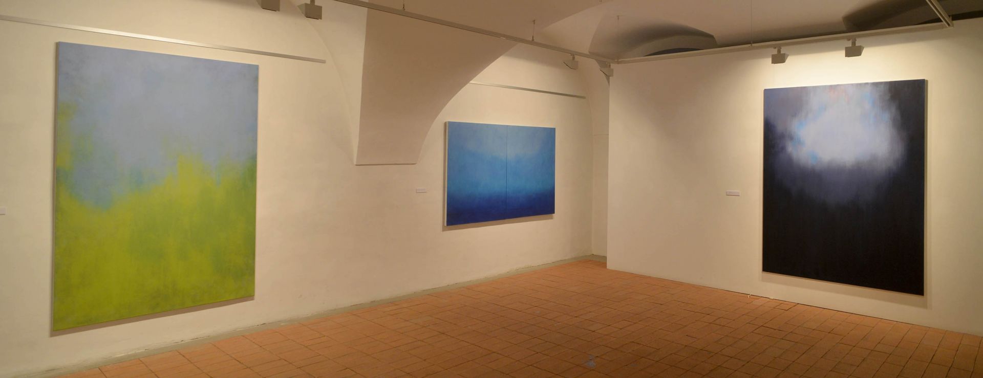
"Landscape, mist, mountain, flower, cloud. Layers of overlapping colours draw out the barely recognisable, more like only suspected, natural shapes. The harmony of the landscape is never disturbed by human beings, we see the ultimate essence of the elements: the foliage, the mist, the air are revealed in their own qualities. One suspects that we are not looking at real landscapes, that the natural motifs are only the means of representation of inner images, lyrical expressions of majesty, power and solitude. These are the threads that embed the works of Ágnes Kontra in the European artistic tradition."
Krisztina Üveges - art historian, Ludwig Museum of Contemporary Art
In her works Ágnes Kontra primarily investigates the phenomena of space (its extension, transparency, delineability) and its possible relationship with things that appear in space (such as plants, natural phenomena). Forms that transform into symbolic signs and dissolve in space initially unfolded and disappeared from the depicted space itself.
She is interested in different methods and approaches. She explores how force reaches form, how a movement shapes a space built with colour. Her experiments in the second half of 2014 have led her from automatic drawing on leftover canvas pieces (free, gestural, precise shapes unfolding from light lines) to canvas cut-outs. Drawing with pen, pencil, pencil on canvas or paper, created with traditional tools was the result of a direct, almost instinctive activity. It was not documentation, yet it documented the moment. The conscious movement - after the meditative activity - was the stenciling (cutting out) in which she recorded a momentary state of free drawing. Closing the space of growth of the form to interpret it by finding new relationships in a new space. The motif, repeated on the surface as a template created an apparent order. Separating, defining the relationship between "before and behind". In this way the causal relationships were rearranged. The structural scheme of reality was transformed, the motifs born from space were arranged in the pictorial space according to a system (grid, imprecise raster).
Some of these images were also on display at the October 2014 exhibition "Obscured Images" (Budapest, B55 Gallery). More pieces from the series are included in the group exhibition "Convey" (New York, XL Space, April 2015). In her latest paintings form is again relegated to the background to give way to formative force. In her paintings the space left free is a space for the possibility of relationships between things. On new canvases spaces are built up by dense or dilute, dynamic or static phenomena left airless, unfolding through colour. Where or at whose peripheries or intersections as focal points (like the circulation and the heart) something happens that is at once important and at once everyday. A flower bursts, a petal falls, it warms or cools, it opens, it fades. Subtle layers obscure perspective, depth, the divisions of space. Situations appear. Proportions and scales are subordinated. They are transparent and full of light. They are imprints, flowers, patterns of reality.
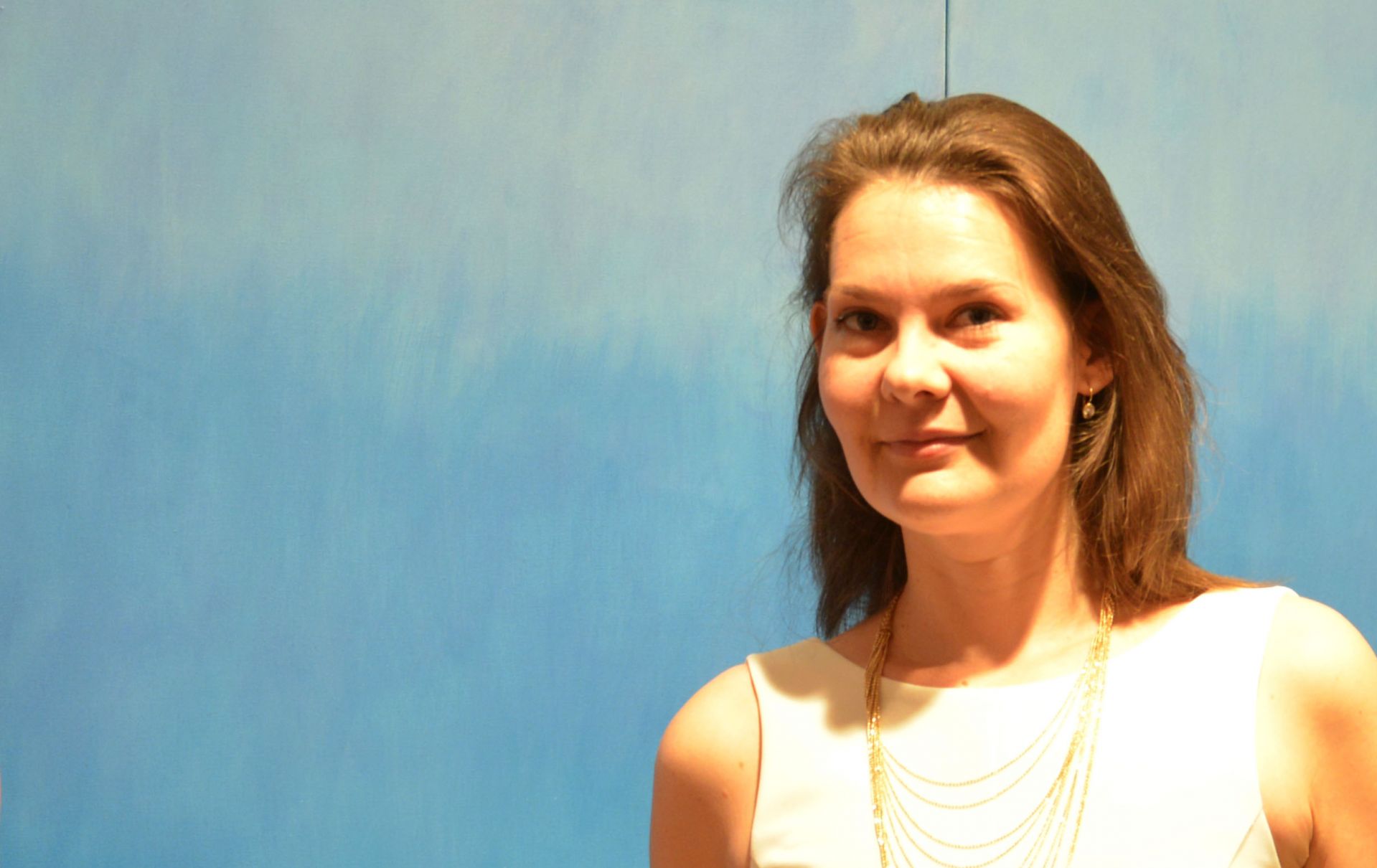
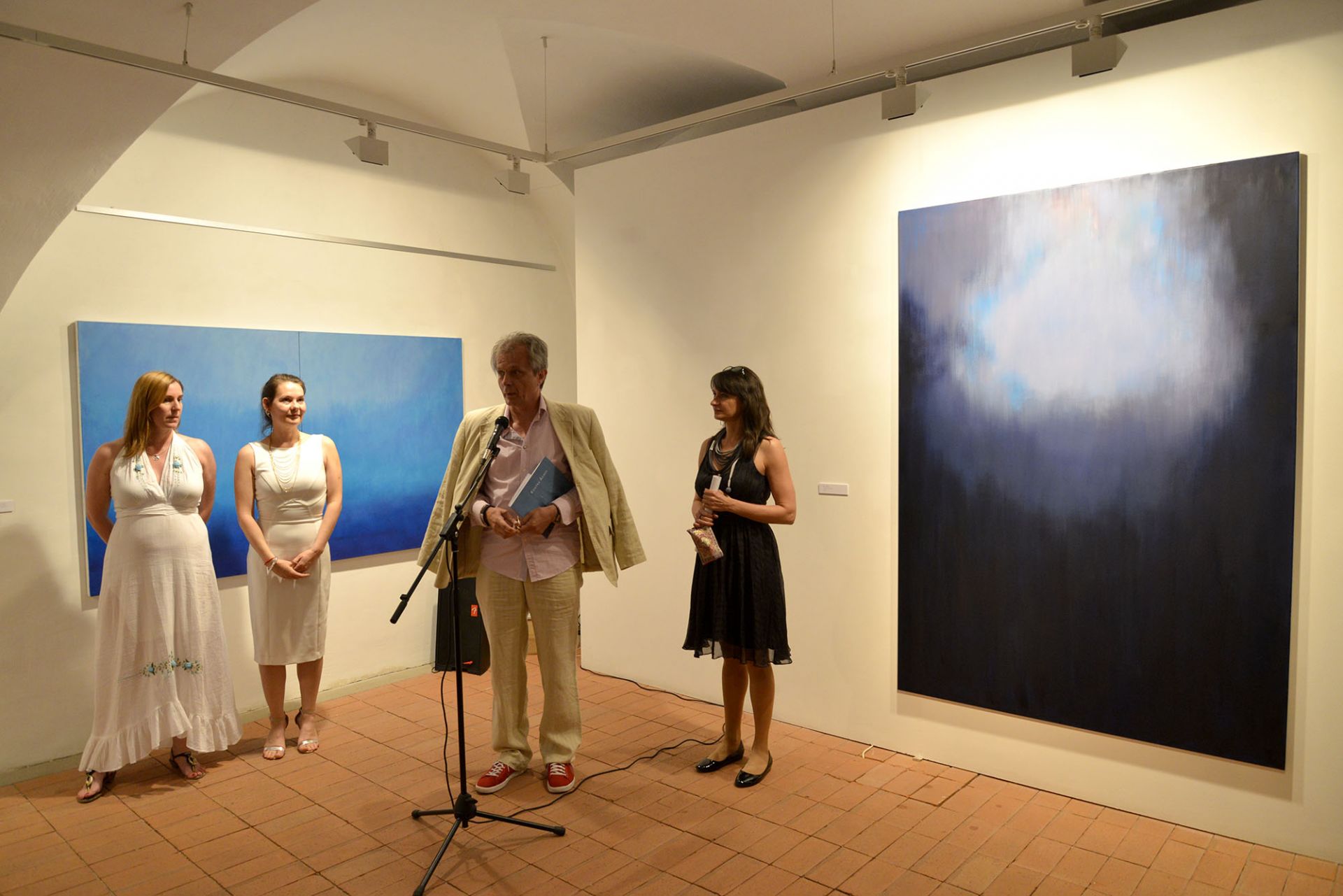
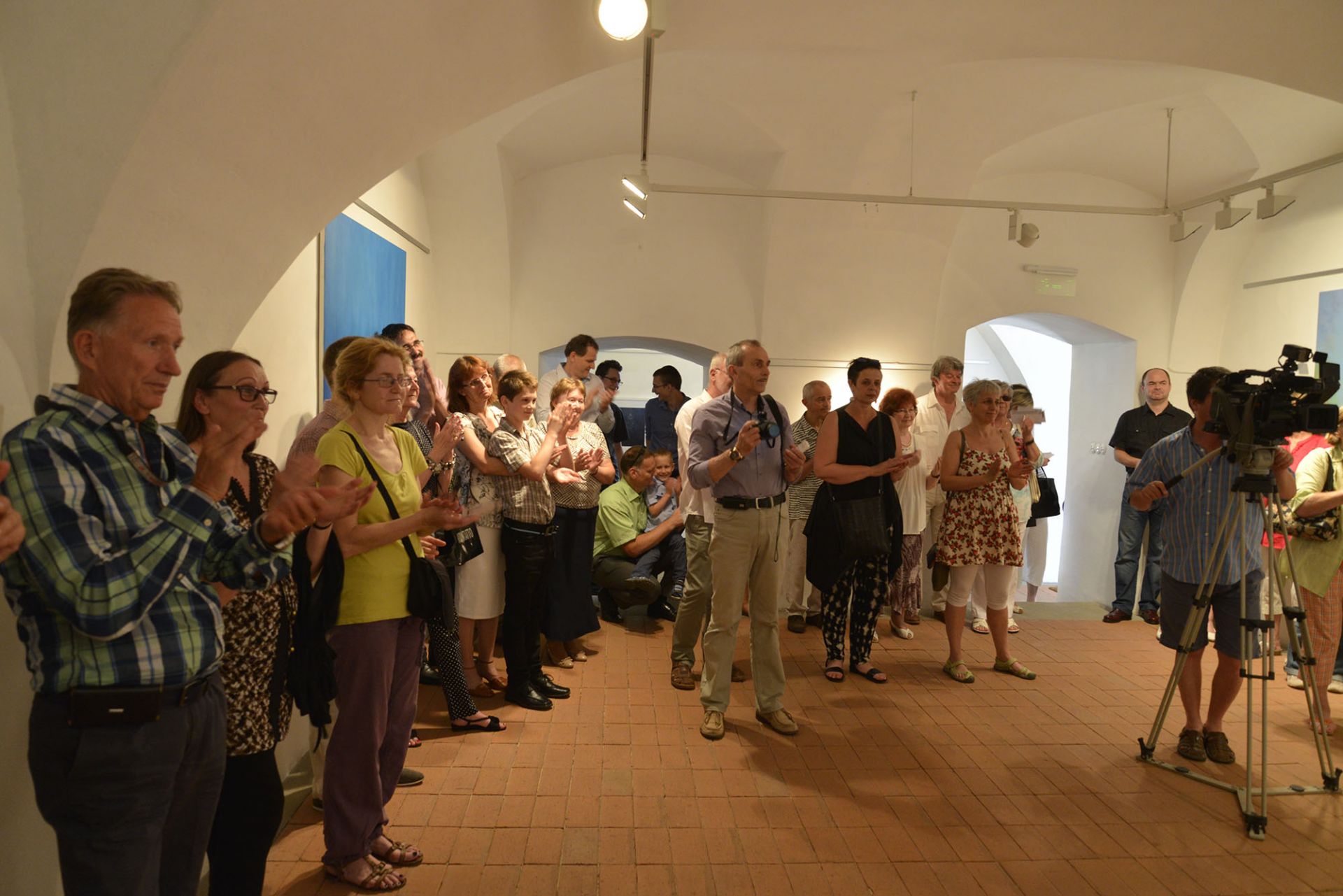
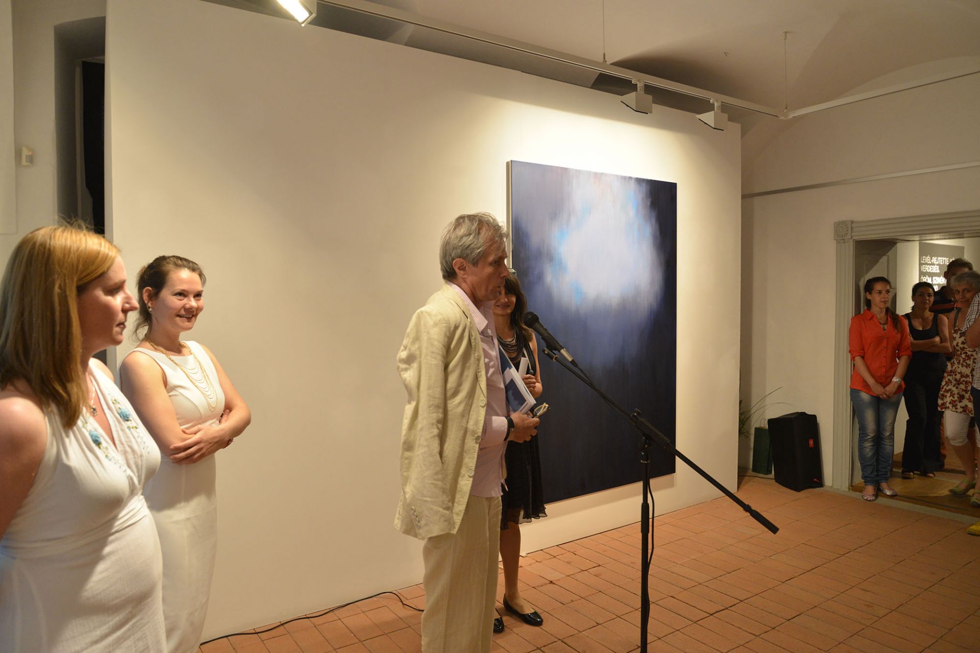
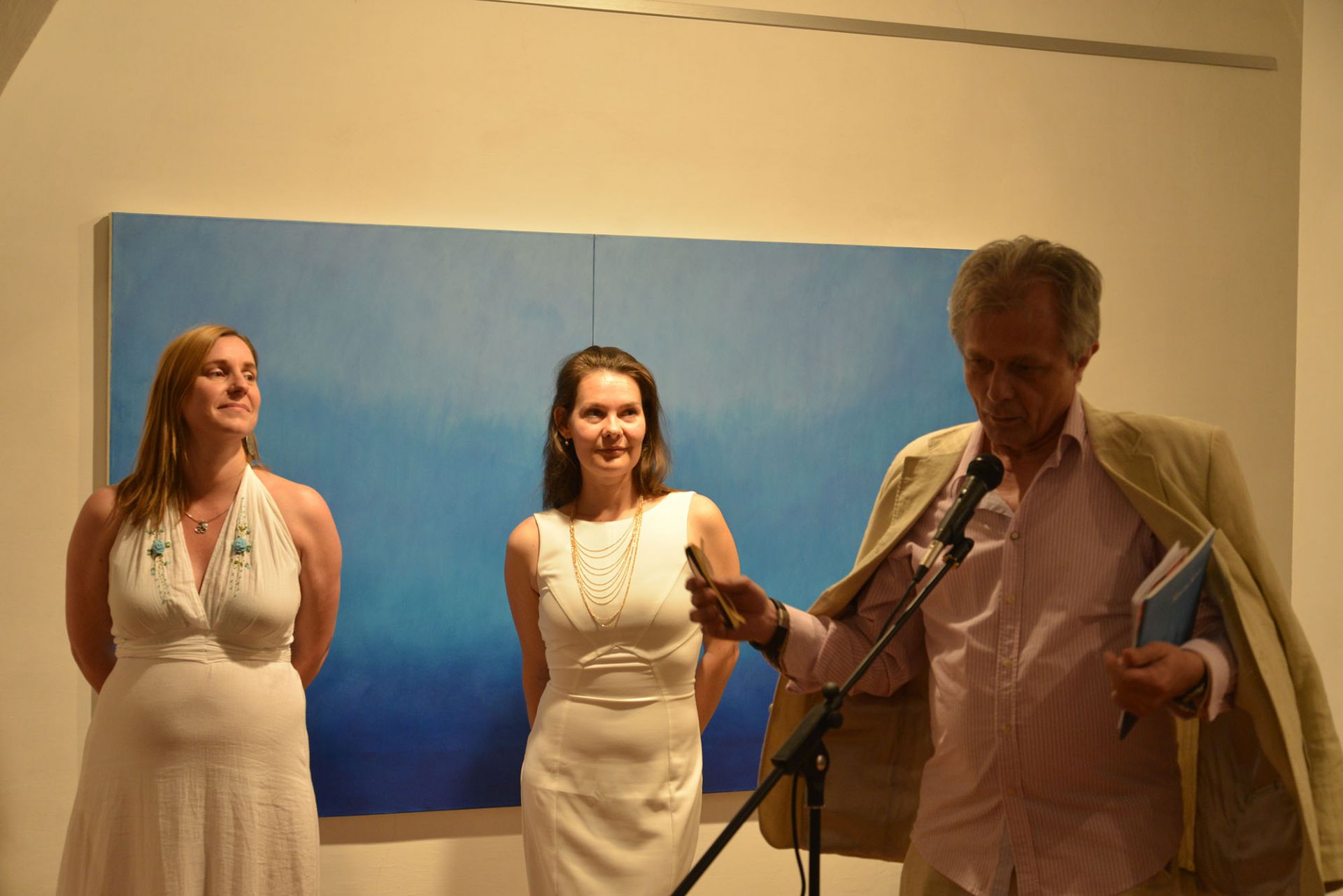
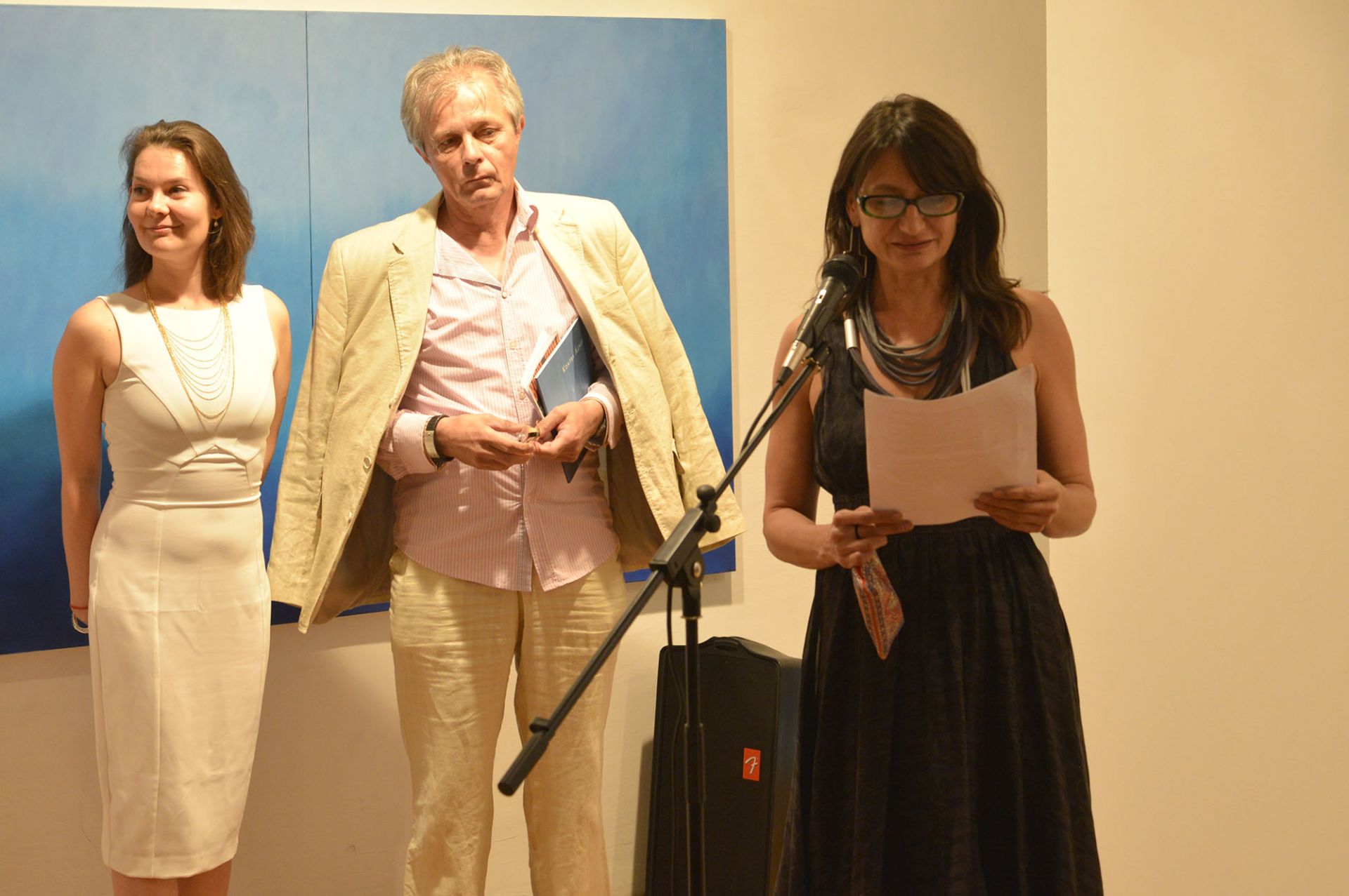
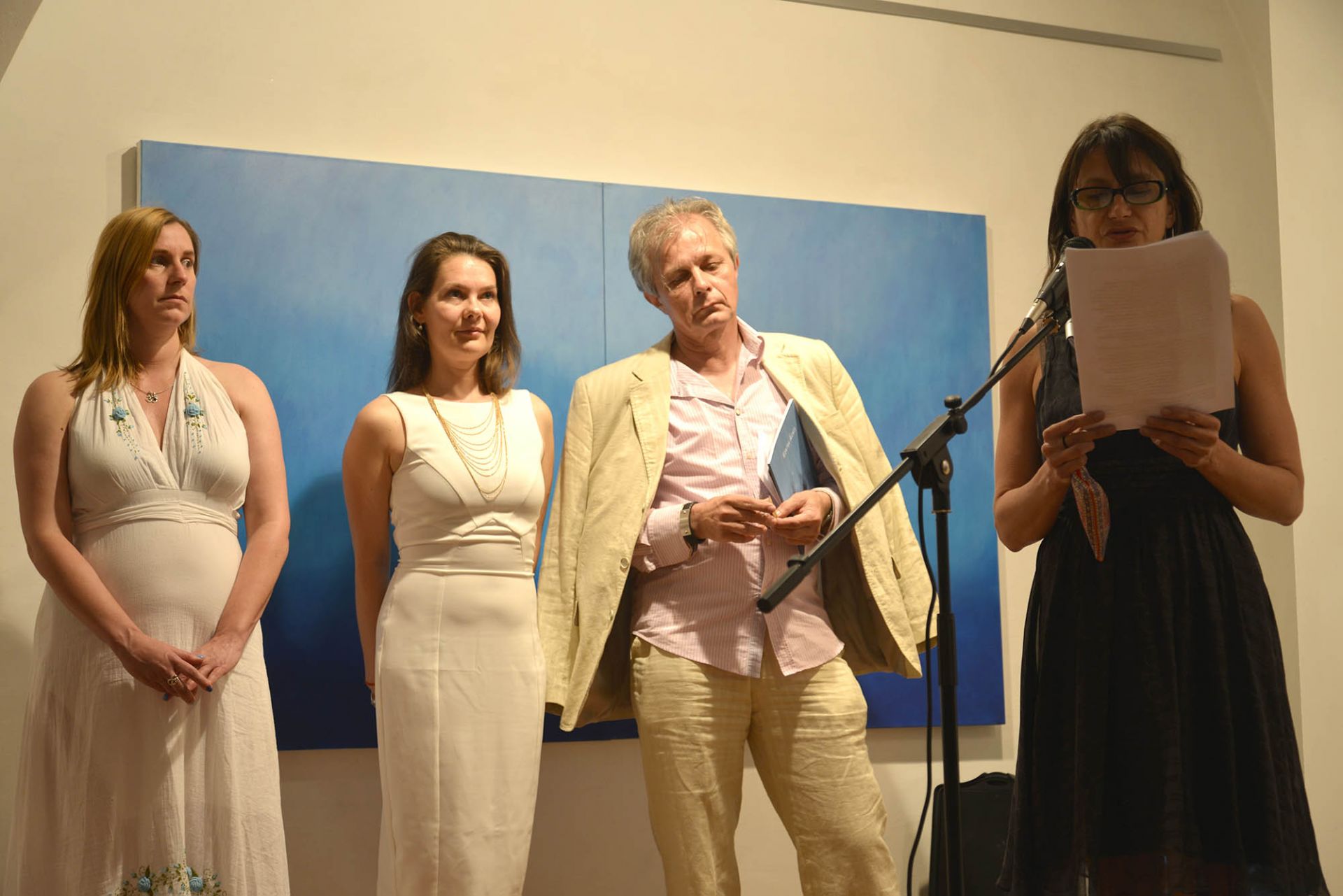
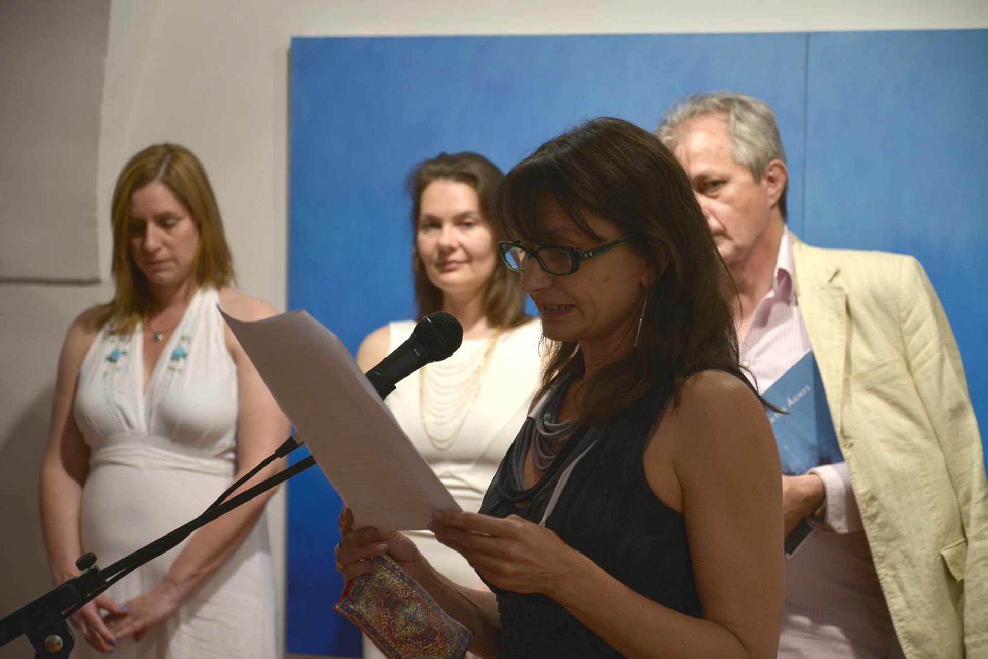
Speech at the opening of the exhibition:
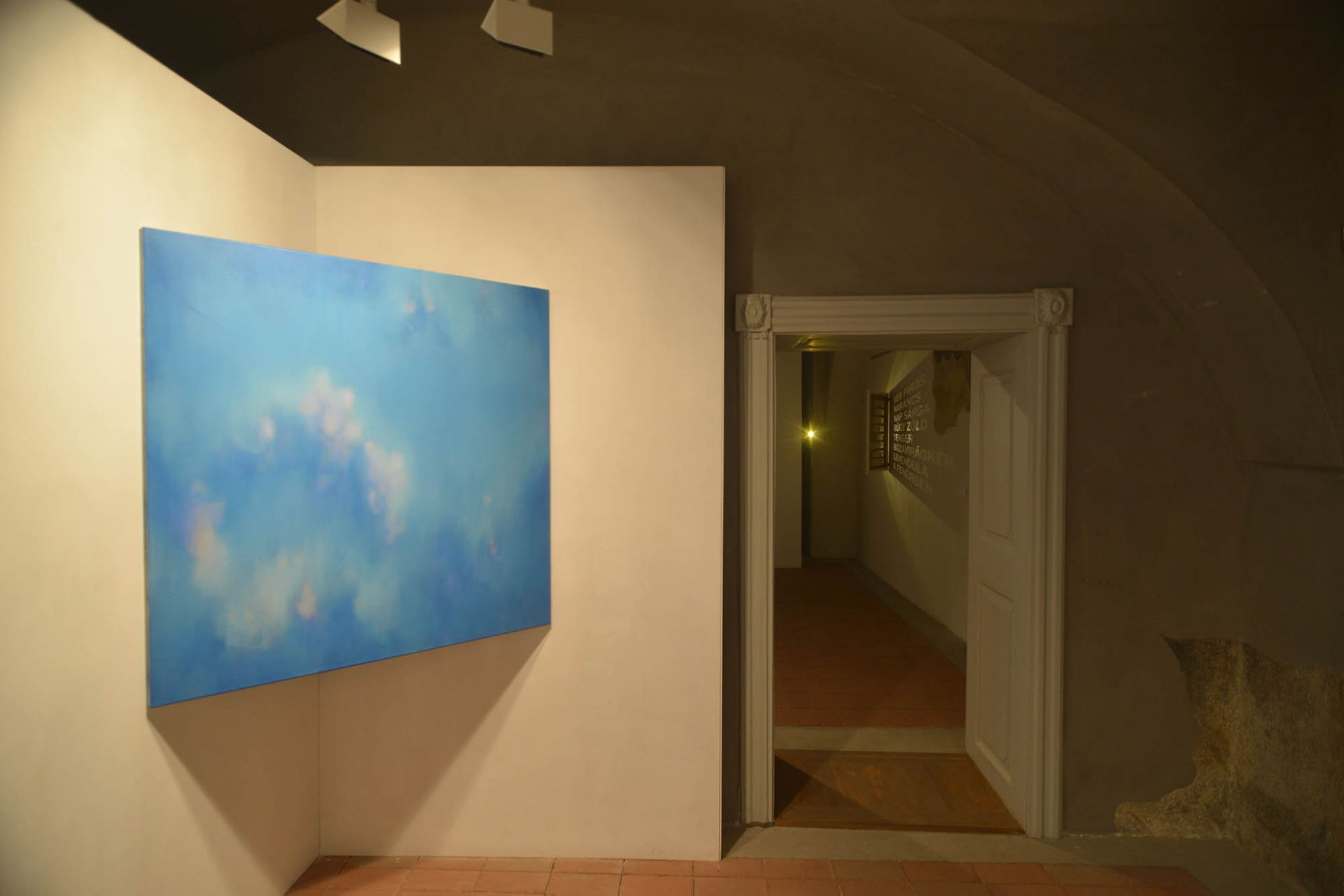
"Before the material on display here was put together in its entirety, we had a few conversations with the artist and the title of the exhibition was discussed. It is unlikely to have influenced - or would have influenced - the works in any way, except that it would give foreign-language visitors some clues if the title of the exhibition were also available in English. I was quite shocked by what Ági told me, that several of her native English-speaking friends could not find the right word for ÁTLÁTÁSOK in English. Would the Hungarian language be so rich in expression? In Hungarian, the word "see-through" has a lot of associative and concrete meanings. It can refer primarily to seeing through some surface or aperture, or to seeing beyond something in a concrete way, or as "seeing through the sieve", to knowing the truth beyond appearances or it can mean the rapid recognition of a solution to a problem.
But the meaning is not really important, because it is about the extent to which the viewer can take in the images as colour surfaces without meaning or to what extent he can become part of them - to slow down. Perception is perhaps important in the case of patterned images, where through the patterns the artist introduces an extra piece of information alongside the colour surfaces. It is undeniable that the basis of Ágnes Kontra's current exhibition is the expression of her intense relationship with colour.
For a painter colour is usually and fundamentally the greatest challenge, whether figurative, subject or abstract. In painting the pure presence of colour also means an intense engagement with the inner problems and laws of art and painting, or a spiritual level of thinking, where the image appears as a symbol of painting and the artist explores the purest possibilities of painting. Even if colours do not form anything, they express or evoke emotions, feelings and moods from our memory. Accordingly, we can speak of cool/warm, wet/dry, loose/dense, airy/heavy or close/distant colours. And of course, the colours of the environment also affect our perception. In any case works of colour are more likely to leave us in a world of our own than figurative images. That is why we prefer to apply the adjective meditative to them.
Johannes Itten (1888-1967), a Swiss art teacher spent almost his entire career collecting and systematising his experience of the properties of colours and their use. He observed that everyone has his or her own palette, a set of colours that is quite different from the others and follows the natural endowments of the individual. For example, one's own colours - hair colour, eye colour, skin colour - play a major role in the choice. In relation to the aesthetics, perception and use of colour he made the following taxonomic statement. We are all capable of using and interpreting colour on three levels:
1 - sensory-optical - impressionistic level, when we choose a colour for ourselves on a visual basis.
2 - psychic - expressive level, when we allow ourselves to be guided by our own state of being and allow this to influence our choice.
3 - intellectual-symbolic or constructive level, when we choose the direction of the subject for ourselves, consciously. Such as the air-sky-water base is blue, the sun is yellow or red.
I would change Johannes Itten's order and put the intellectual level first, which I think precedes the other two. And there is one very important element missing and that is playfulness, experimentation, which is a high degree of freedom.
In Arthur C. Danto's The Transfiguration of the Commonplace he describes the story of Kirkegaard, who had a pithy story about a monochrome picture. He had been given a red painting by an artist who, when asked what it depicted, replied that it was a picture of the crossing of the Red Sea when the Jews had already crossed and the Egyptians were drowning. If no explanation is given for the image we are left with the many associations of the colour red: blood, pain, fever, hell or passion, intense joy, the overflowing wonder of the sunset, which is likely to be further coloured by our moods and situations in life at the moment. In other words the painting can change with us, it is freely shaped by us.
But there is another important component of colour - its saturation, its shades - and that is light. The direction and amount of illumination naturally plays a major role in the mechanism of action of Ági's paintings and this is natural, since colours are perceived by the eye only through the transmission of light. In other words, "Colour is a sensation generated in the brain, the brain's reaction to light". Newton discovered in 1666 that a prism breaks white light into different colours of the colour spectrum. If "white light is shone on a prism, it breaks up into colours as it passes through the prism. The coloured light bands appear on the reflecting screen in the following order: red, orange, yellow, green, blue, violet. This arrangement of bands is called a spectrum."
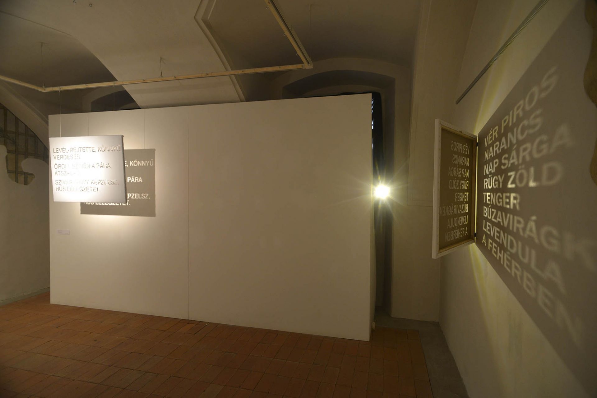
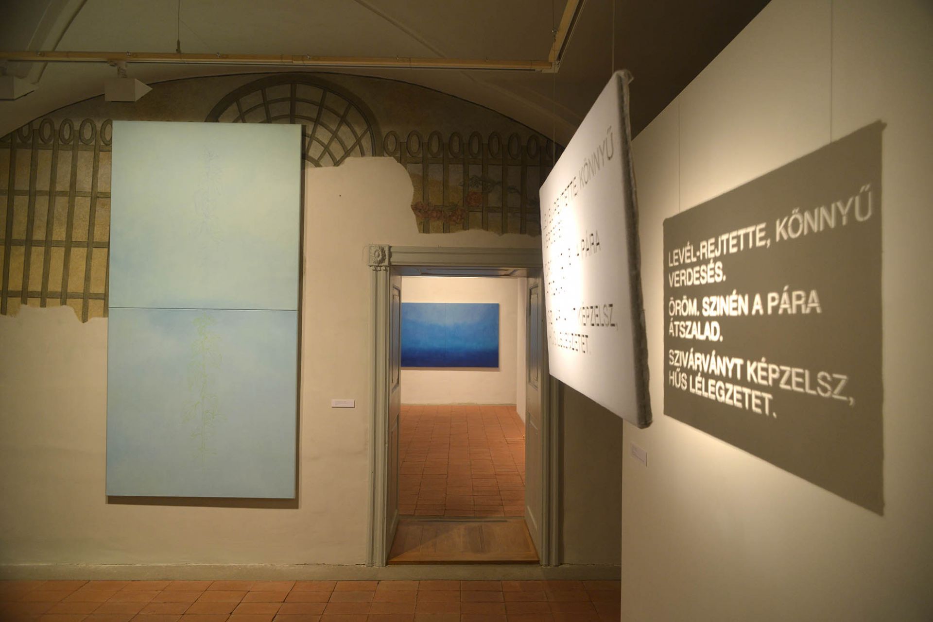
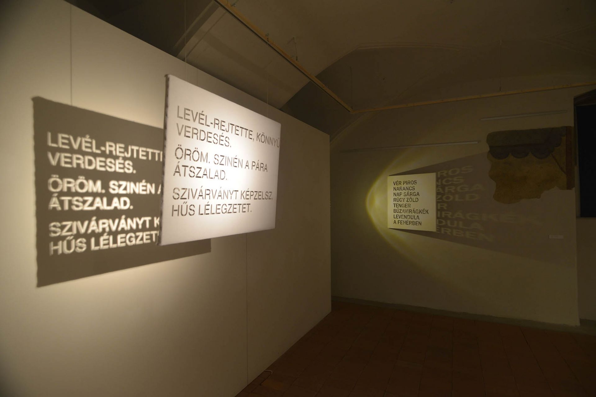
The exhibition includes a couple of texts, which is the artist's own description of the spectrum of colours in verse. And these images have something to do with poetry, not only because of the amplification of feelings that can be expressed in words. The monochrome image becomes defined by its own internal laws, by the reduced use of colour, that is to say, it becomes a dynamic system of sensitive harmony, of unity or contrast, of rhythms. For the artist this work is a constant struggle, a struggle with time, with the times of day, with moods, with her own internal changes, which are greatly influenced by the lighting conditions and not least by the situations in the space. This genre emphasises openness, the fact that this is pure, absolute painting, which is not closed, has no concrete object, is not "iconic", rather metaphysical, which not only abandons the representation of the "image", but also renounces the material as pure matter. Although, let's admit it, images are close to reality, as it were "close to reality" (as I was reading the quoted words of Gizella Rákóczi in the Life and Literature on the train on the way here, by Lászlo Beke). This spirituality perceived here presupposes the possibility of repetition, of transformation in structure. This system, which is characteristic of Ágnes Kontra is permissive of patterns and organic motifs, which break the monochrome as a kind of surface element.
In addition I would like to share with you the surprising and interesting addition at the end of the opening that Ágnes Kontra did not get stuck in this not insignificant - single artistic problem outlined by the pictures shown here. The artist's attention has not been spared the modelling or absorbing qualities of colour. But this is a moment that is difficult to integrate into the pure painting on display here and so she has embarked on a unique experiment - made possible, of course, by her outstanding sculptural skills - to investigate how an object in space - in her case, surprisingly, a portrait sculpture - behaves when given colours and surface coatings that are designed to hide the sharp contours of forms by absorbing light.
These portraits are not shown here, only in her catalogue of recent works.
With this I would like to bring this publication to your attention and hereby open the exhibition."
Brigitta Muladi, art historian