András Gál is one of the few painters who has consistently and uncompromisingly committed himself to monochrome painting for many years. What for many is only an in-between era, perhaps an end or a turning point in their development as painters, for him it embodies a straightforward and unshakeable strategy.
"The reception of monochrome painting is largely determined by a rhetoric of renunciation and such painting, which uses a single colour per image is experienced as limitation, reduction or minimalism. As a consequence, monochromy is presented as an ascetic artistic practice that consciously renounces the multiplicity of pictorial possibilities. But if one takes a close look at András Gál's work then easily comes to the opposite conclusion, namely that his use of colour is a gesture of generosity, of excess: a saturation, exaggeration and waste of colour (in the Georges Bataille sense). Let's not forget that one of Gál's defining experiences during his studies was the material images of the Viennese actionist Otto Muehl, with their ecstatic power to summarise art and life.
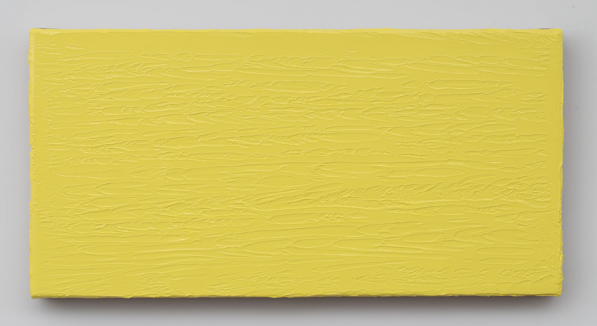
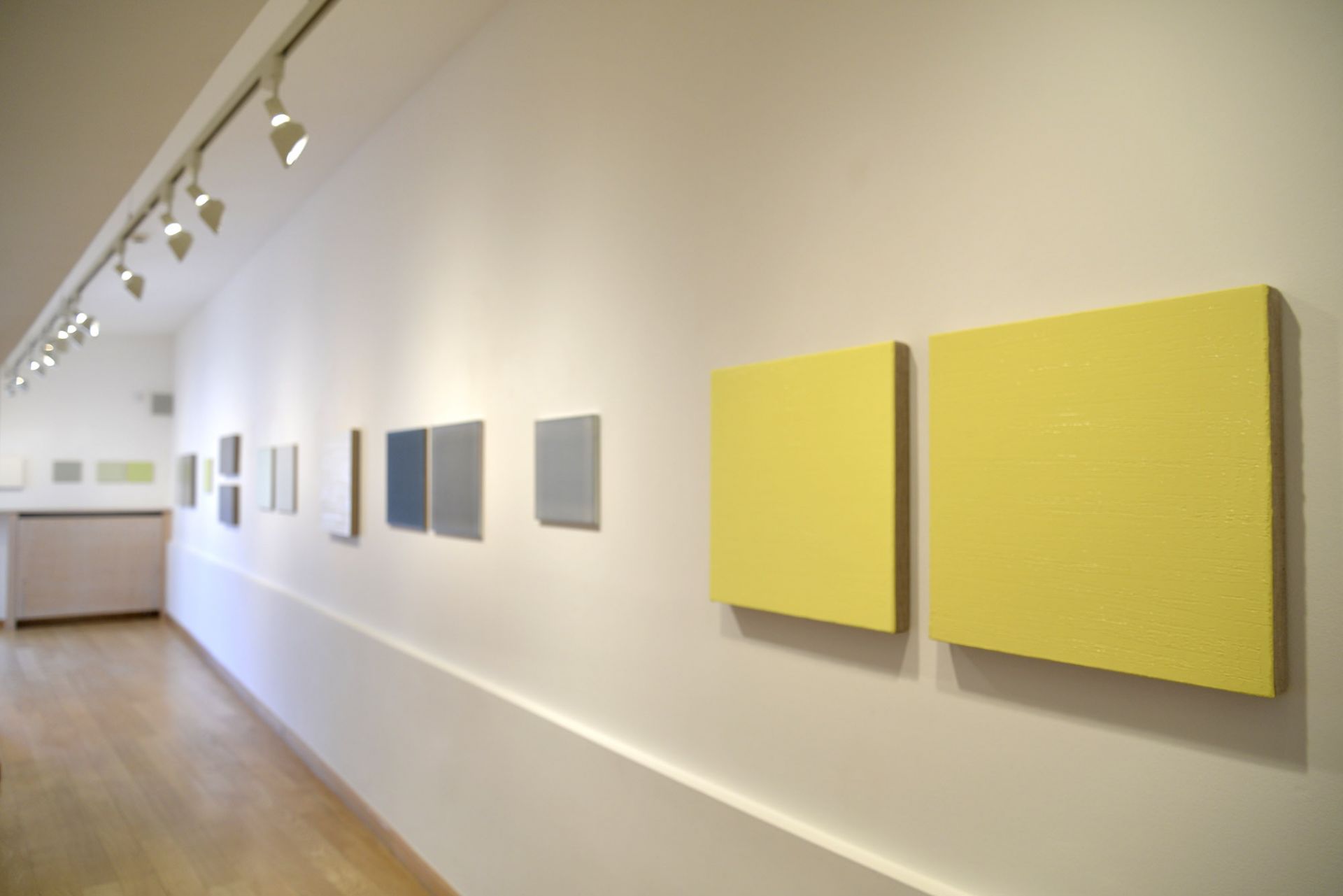
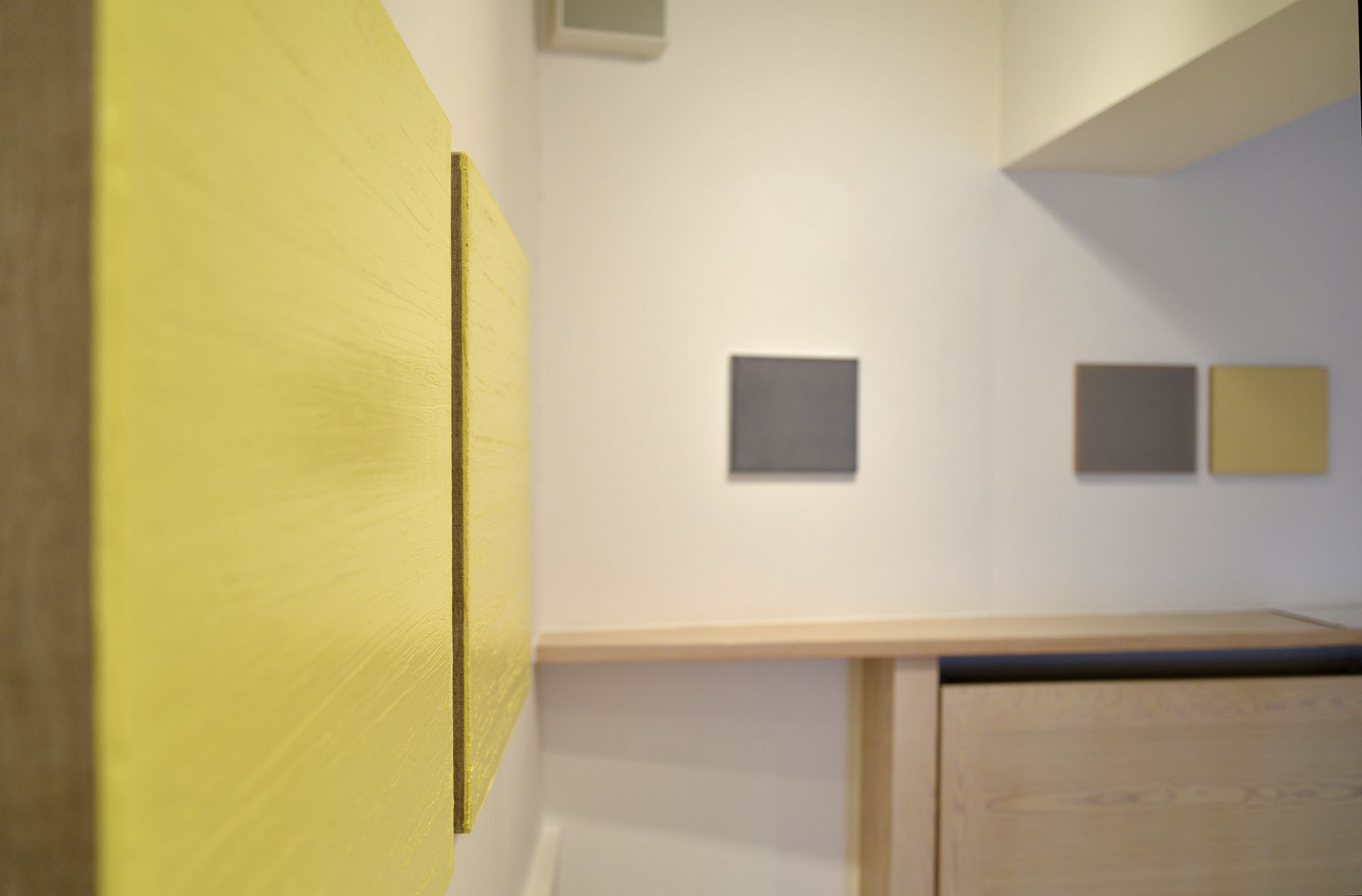
Perhaps the word "monochrome" is more an interpretation than a description of Gál's painting. It suggests that the artist is primarily interested in chroma, colour as such. In comparison, András Gál's surprising statement in an interview in 2013 reads, "I do not consider myself a colour painter." In order to understand this we only need to look at the way in which painted colour appears in his work. In this respect the facture of his paintings, the way the paint is distributed on the surface of the substrate is crucial. His most recent works in light grey, white and yellow are 50 x 50 cm squares or 30 x 60 cm horizontal formats. Unlike in recent years the sides of these paintings are not painted. Thus the two material components of the painting, the raw canvas as a support and the layer of oil paint on top of it and their relationship to each other remain clearly legible. Gál's paintings are characterised by the sometimes finer, sometimes coarser structuring of the surfaces, the rhythm of the protrusions, indentations and cracks in the paint, the painting process, the various traces of the distribution of the oil paint with spatulas and paint rollers. With Gál the paint with its light sheen always looks fresh, always gives a sense of moisture and pastose fullness. This means that colour does not appear to him as a vibrant visual field or colour space in which the viewer can contemplate and immerse himself, but as a material substance distributed on the support. The colour value of pigment is secondary to this sensory-material presence.
Dorothee Joachim's paintings are ideal counterpoints. The first joint exhibition of the two artists offers a unique opportunity to experience two consistent, if you like, radical painting strategies in direct comparison. Placed side by side the specificities of their individual approaches to painting are clearly visible, especially in the comparison of the palette of grey pictures.
Dorothee Joachim's paintings are perceived by many viewers as monochrome paintings and from a distance they do indeed appear as homogeneous, slightly vibrant or floating fields of colour, often difficult to define conceptually. However, up close it is clear that their colouring is the result of the layering of several colours. Indeed, the paintings are never monochromatic, but are always composed exclusively of the three primary colours: blue, red and yellow. They differ from Gal's works in almost all parameters. Dorothee Joachim paints her pictures in acrylic on woodblocks (not oil on canvas), not in a single session, but in numerous very dilute layers of lazur always applied to the entire surface and stacked in a very time-consuming manner. The paint itself appears dull and dry, not wet and shiny. Joachim's small- and medium-sized paintings on MDF panels are essentially in a slightly reclining format, in the 22 x 25.5, 30 x 35 or 40 x 46 cm sizes favoured by the artist. Their length-to-width ratio is always the same (about 1.15:1).
But the biggest and most important contrast to András Gál's paintings is the facture. Dorothee Joachim's works also show a rich and varied surface texture, the result of a unique painting method. That the surfaces of the paintings are not homogeneous at all, but are covered with tiny grains, protrusions, craquelé or hairline cracks, which can only be recognised on close inspection. The decisive point is that these structures are not painted, but are intrinsic to the properties of the materials used (pigments, binders and water). The microstructures on the surfaces of the paintings are the result of chemical and physical processes that take place during the application of the paint and the drying periods, quasi-natural processes of formation. Joachim controls these processes by her method of colour application and by repeatedly rotating the MDF panels suspended on the wall during the painting process. The result is most clearly visible at the edges of the paintings. A grey picture, for example, might be yellow at the edges - not because Dorothee Joachim painted it yellow, but because the pigments have accumulated this way on their own, obviously due to the special adhesive forces acting on the edges of the MDF boards. Joachim's paintings therefore have the fascinating property of self-framing. It is precisely in the edge zones that her paintings show the most striking deviations from the apparently even distribution of the colour surface.
However different Dorothee Joachim's and András Gál's working methods are, beyond the purely visual aspect they are similar in that the materials and the specific working processes have a decisive influence on the visual and colour effect of the paintings. The similarities and differences between these two painting strategies offer visitors to the exhibition a rich field for surprising discoveries and insights into the many possibilities of non-figurative painting."
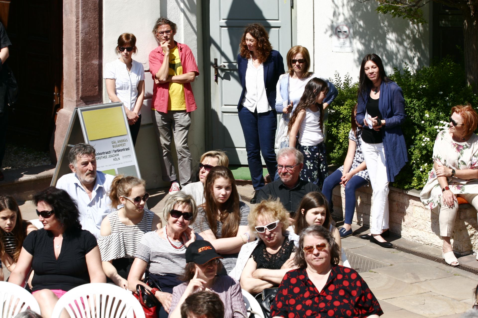
Text at the exhibition opening by Peter Lodermeyer